In this article:
These forms can be integrated on an existing page of your website, with a few lines of html code. Before you start, make sure to know the dimensions in pixels (width and height) of the area you’d like the form to go.
How to create an iframe form
To create an iframe form, you can start from a blank form or a ready-to-use form template. Like our predrawned email templates, our subscription forms templates are professionally designed and save you valuable time. You can use them as they are or adapt them to your needs. Get inspired!
Learn more >
Forms ready to use:

How to integrate the code of an iframe form
Go to the section, then click the actions menu to the right of the desired form.
Then select Get the code.
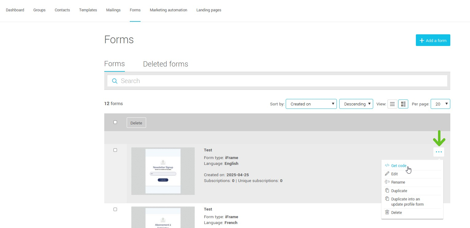
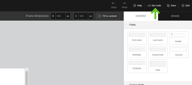
If you choose to access it through the form editor, click the Get code button located in the top right corner.
Copy the code. You must have access to the HTML code of your website to paste the iframe code in the desired location.
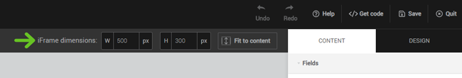
Adjust iframe size
An iframe is an area with defined dimensions. If, for example, you want to insert your form in the footer of your website and the available space is 450 pixels wide by 250 pixels high, use these dimensions. The size of your form can be modified in the form editor. That way, your preview will reflect the right size, and the code provided will have the appropriate dimensions.
How do I avoid the scroll bars in my iframe?
When your iframe is too small for the content, scroll bars appear. You can avoid this by modifying your form to make it smaller or by increasing the size of the iframe.
My iframe is not displayed properly on mobile ...
You may need to adjust your site's css code to properly display iframe on mobile. Here is a technique that generally works well:
- When pasting the iframe in the html code of your website, add a (div) container around the code like this:
<div class="responsive-form">

	 <iframe src="https://app.cyberimpact.com/clients/xxxxx/subscribe-forms/xxxxx-xxxxx-xxxxx-xxxxx" width="450" height="250"

	 frameborder="0" marginheight="0" marginwidth="0" scrolling="auto">

	 </iframe>

</div> - In your css file, add the following lines:
@media (max-width: 600px) {

 .responsive-form {

 position: relative;

 overflow: hidden;

 padding-top: 55.556%;

 }

 .responsive-form iframe {

 position: absolute;

 top: 0; left: 0;

 width: 100%; height: 100%;

 }

 }
If you want to keep the full screen aspect ratio when the form is minimized, use the following calculation: 100% / (width / height). For the example above: 100% / (450/250) = 55.556%.
You may need to make adjustments: check the display on a real phone if possible or by minimizing your browser window for a quick preview.
Use custom confirmation pages
When a person fills out an iframe form, the confirmation message replaces the form. A customized message will likely look better than the default one provided.Learn more about confirmation pages >